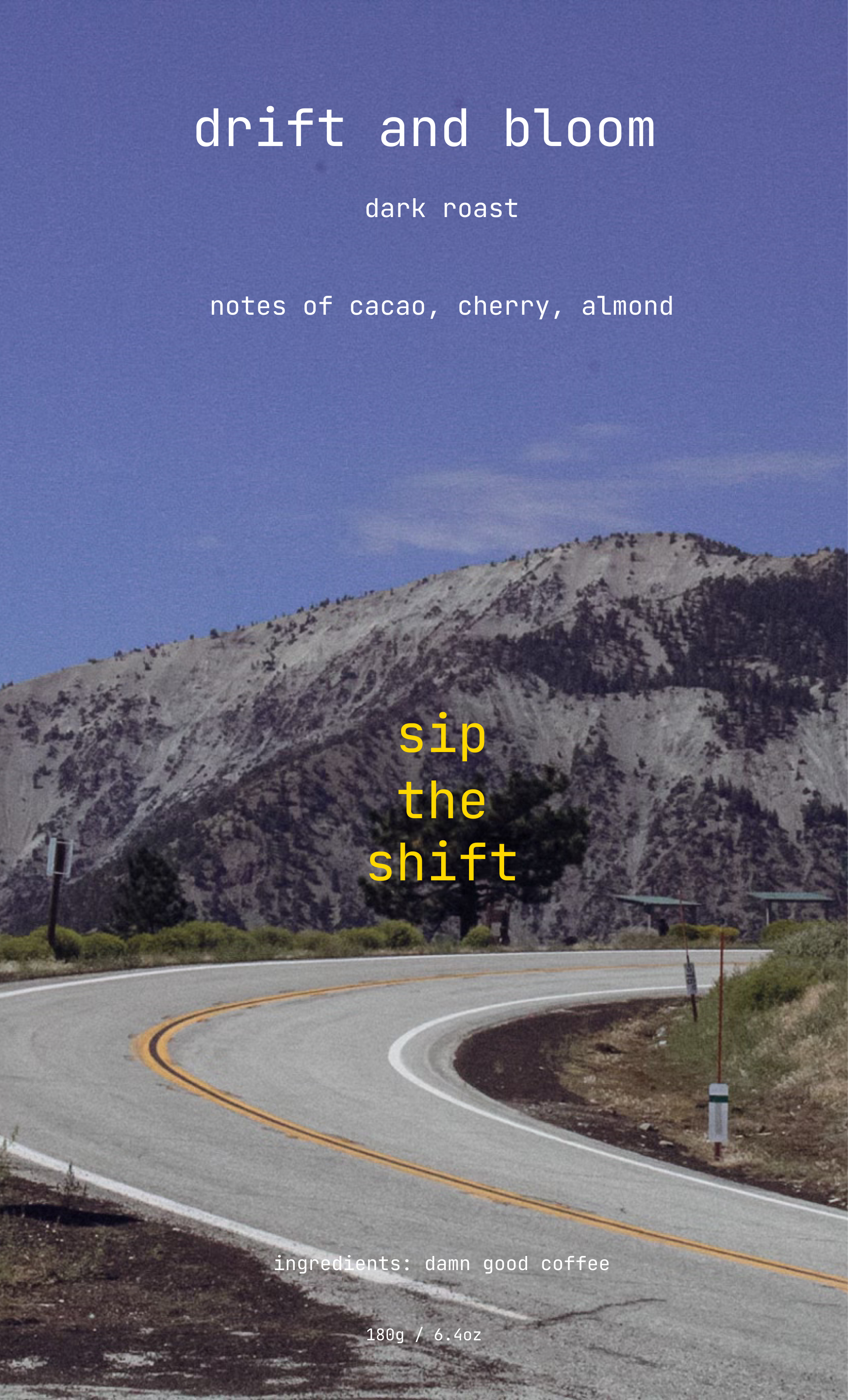
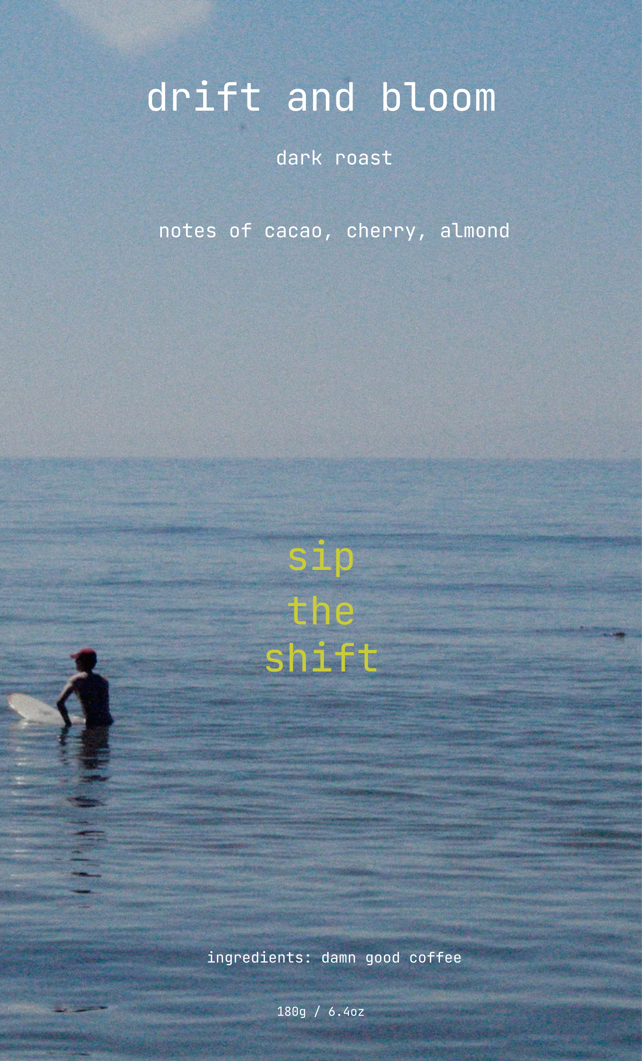
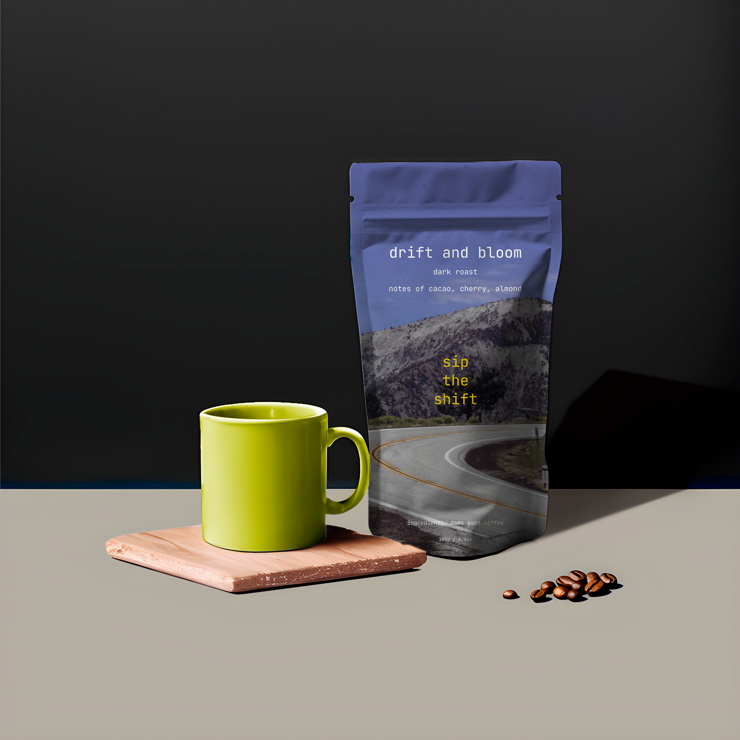
PACKAGING DESIGN
Petal Pop is a non-alcoholic spritzer brand blooming with rare florals, clean ingredients, and sensory joy. Our design is playful yet refined—soft blush tones, whimsical illustrations, and thoughtful minimalism that reflect the purity inside every can.
We exist to bring fizz with integrity: no sweeteners, no weird stuff—just beautifully sourced botanicals and unexpected flavor pairings that spark curiosity and delight. With every pop, we’re redefining what a drink can be: ethical, elegant, and joyfully different.


This packaging design for FLUSHD embraces a minimal yet high-impact aesthetic, deliberately crafted to appeal to a luxury-conscious audience while maintaining an accessible price point. The design language is clean and confident—anchored by the monochrome, metallic black finish of the tube, which evokes sophistication and modernity.

The Design Concept: Intuitive Beauty, Tangible Warmth
At flushd, design is not just aesthetic — it’s emotional. We set out to create a bottle that feels as good as the product inside. Every curve, texture, and detail was crafted to evoke a quiet intimacy: the kind of beauty that feels personal, unhurried, and entirely yours.
The silhouette is soft and organic — rounded edges that sit comfortably in the palm, mirroring the softness of a natural flush. There’s an intentional simplicity to its form: minimal, but not stark. It doesn’t demand attention; it invites it.
The finish is velvety-matte, offering a subtle tactile pleasure. It’s meant to be held — not just used. You might notice how your fingers naturally rest along its contours, how the weight feels balanced and intentional. We wanted the experience of picking up flushd to be grounding, like a familiar object you return to again and again.
The color palette is sun-washed and earthy — subtle tones that reflect our philosophy of enhancement over transformation. Hues are inspired by the natural flush of skin warmed by light: never artificial, always alive.
Even the dispensing system is considered. Precise, mess-free, and effortless — it delivers just enough with a single press, supporting your pace, your messiness, your motion.
flushd is not just about how you look, but how you feel when you use it — calm, capable, radiant in your own rhythm. The design reflects this ethos: an object made not just to serve, but to resonate.
3D MODELING
3D model for a concept makeup line named “flushd.” Rendered in SHAPR3D
Photo of 3D model for blush compact

Packaging Design Explained
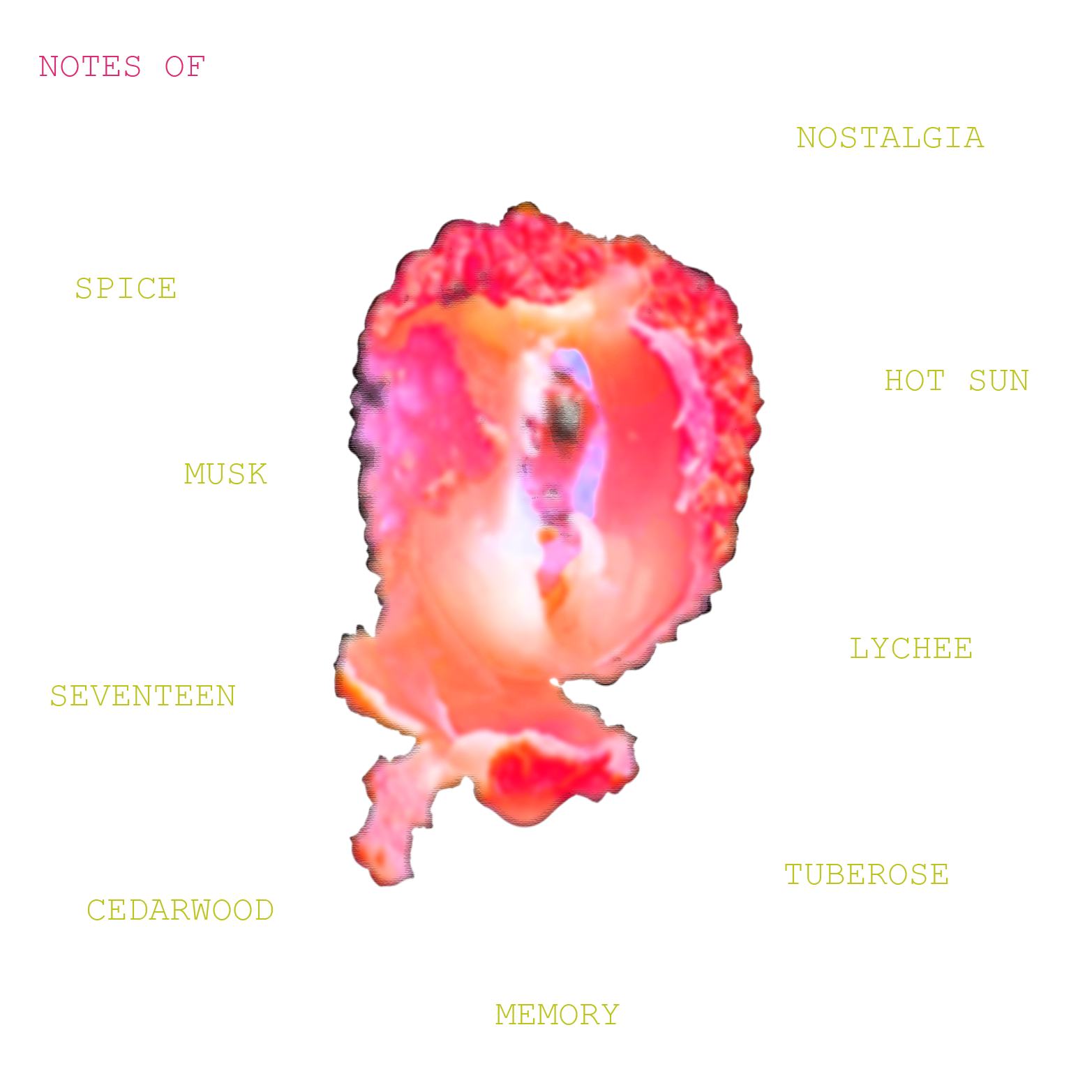
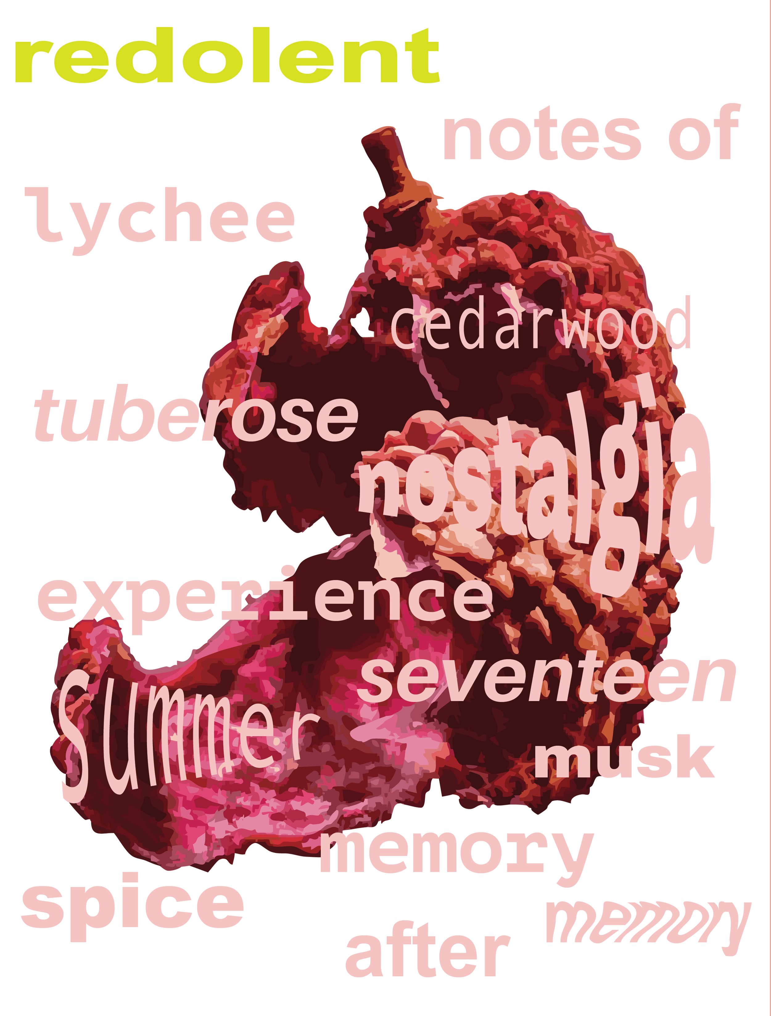
The FLUSHD packaging is designed to embody emotion, movement, and modern femininity, with every element working in tandem to evoke the experience of a flushed cheek—a visual cue for warmth, vitality, and effortless beauty.
The pink, marble-textured finish of the box isn’t just decorative—it’s intentional. It mimics the natural, watercolor-like bloom that appears in the skin when one is alive with energy—after a laugh, a dance, or a moment of bold vulnerability. It’s this moment that FLUSHD captures, bottled into product form and wrapped in packaging that feels personal, intimate, and expressive.
Who is the FLUSHD girl? She’s the kind of person who turns heads without trying. She wears simplicity like a statement. She cares, but never clings. She’s bold in quiet ways—her eyeliner might smudge after a night out, but her standards don’t. The FLUSHD girl is on her own path—not to impress, but to express. She strives to be authentic, sensual, and free. She's deeply self-aware, not self-obsessed. Her coolness comes not from perfection, but from how easily she owns her imperfections. How the packaging reflects her: The soft pinks suggest femininity, but never fragility. The marbled swirls are organic and irregular—just like her. No two boxes are exactly the same, and that’s the point: individuality is the luxury. The white FLUSHD logo, bold yet rounded, gives a confident but approachable tone. It’s not screaming—it’s speaking. The poetic text wrapping the sides in English and French (e.g., “for the best of you / pour le meilleur de toi”) evokes sophistication, globality, and a sense of care that transcends surface beauty.
Together, these design choices cultivate a sense of elevated ease—luxury that feels lived-in. The packaging doesn't just sell a product; it tells the FLUSHD story: one of soft rebellion, confident presence, and beauty that feels like it belongs to you—not borrowed.
Design explanation continued
The logo, FLUSHD, is set in a bold, sans-serif typeface, centered and spaced with precision to communicate clarity and trust. The absence of visual clutter allows the product to speak for itself—reflecting a minimalist philosophy where form follows function. Surrounding the product is a circular typographic element that reads: “for the best of you / pour le meilleur de toi”—in both English and French.
This bilingual repetition not only enhances the brand's global, inclusive feel but also reinforces the brand’s mission: to elevate self-care into something intentional and refined. The circular layout suggests continuity and self-reflection—aligning with a wellness-driven, ritualistic consumer experience.
By combining premium visual cues—like monochrome tones, structured typography, and spatial balance—with approachable messaging, this design successfully straddles the line between affordable luxury and everyday elegance.
3D render of a concept garment collection. Rendered in CLO 3D

2D ANIMATION
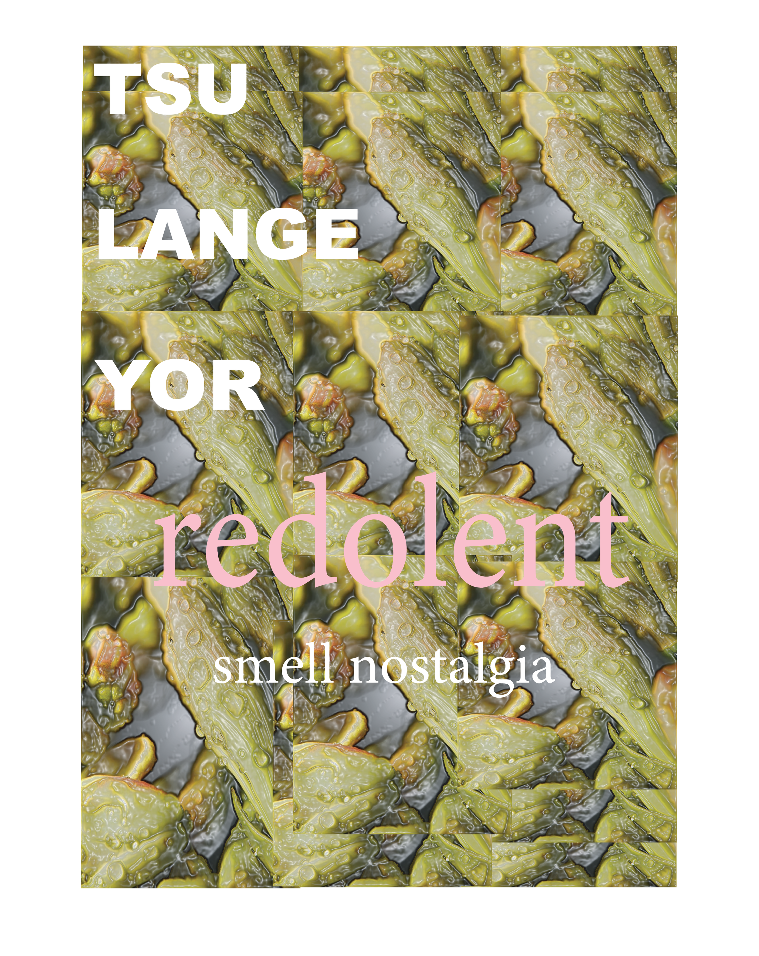
EDITORIAL


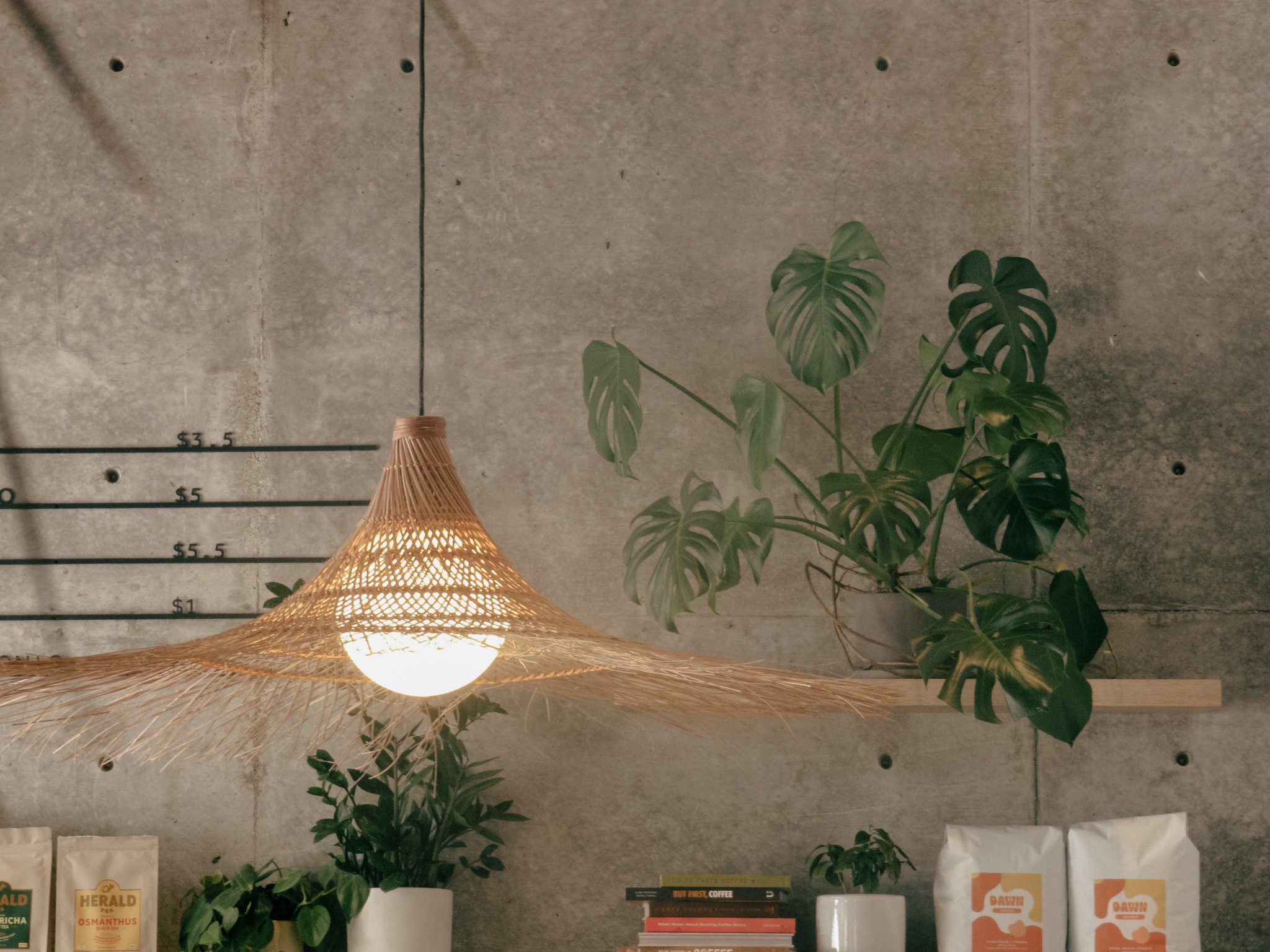
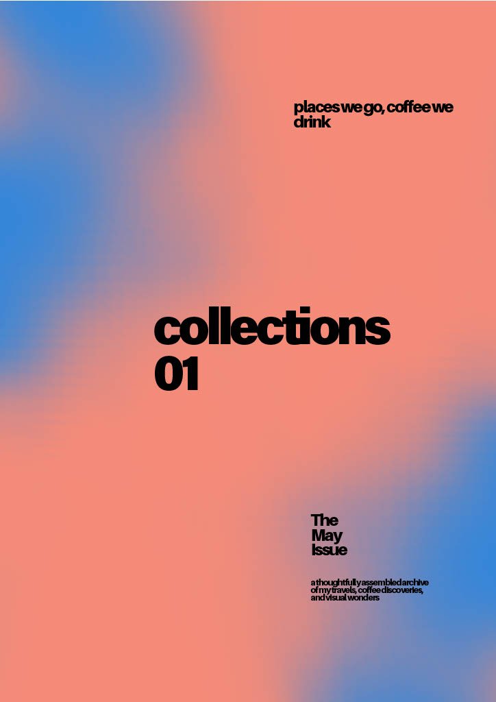
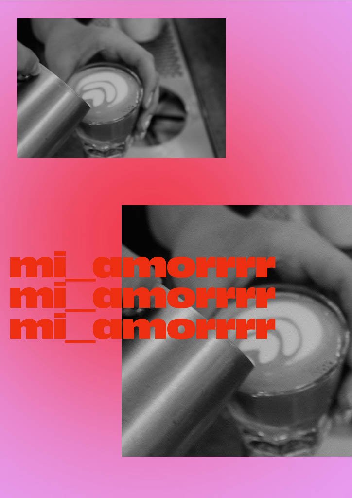
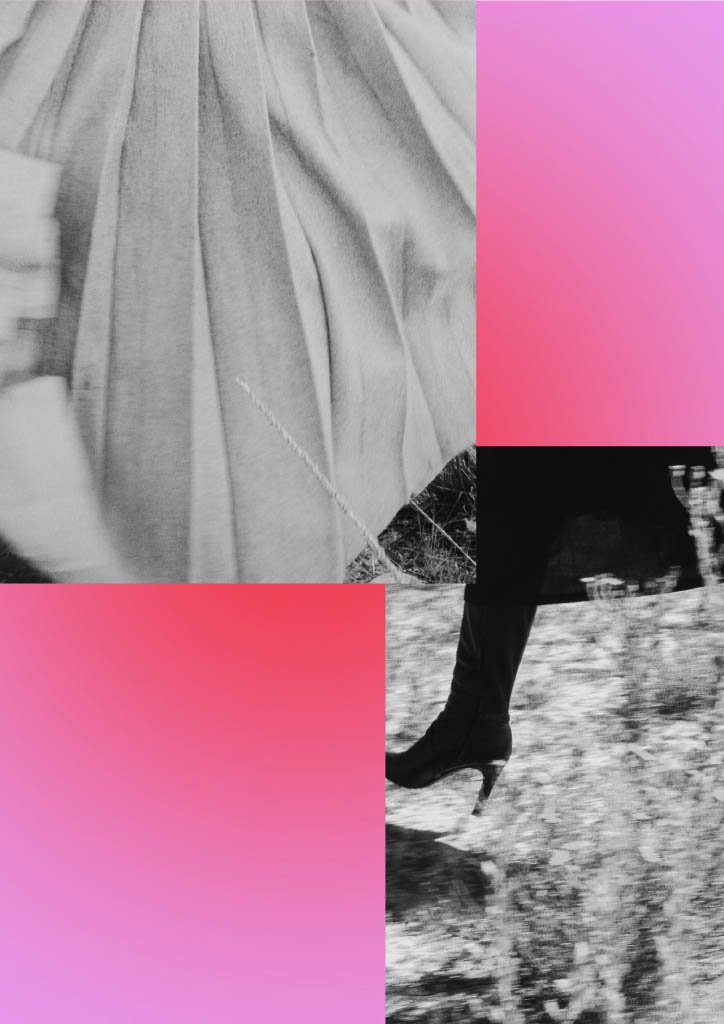
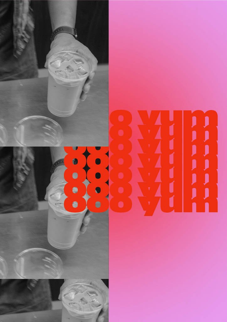
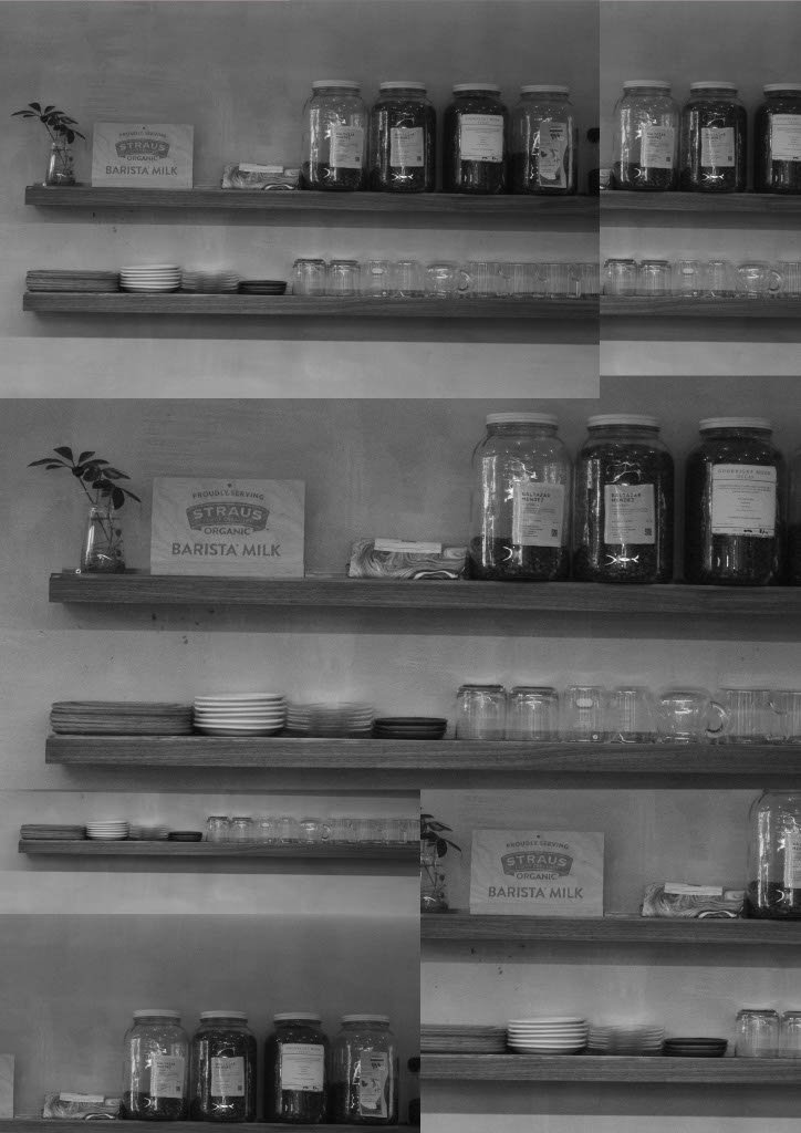
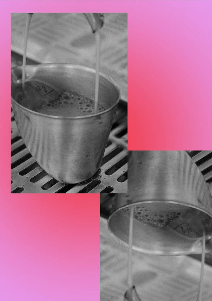
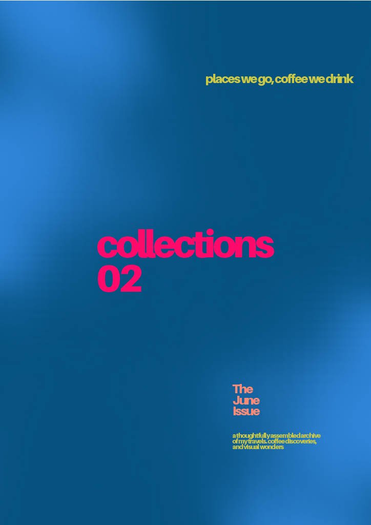
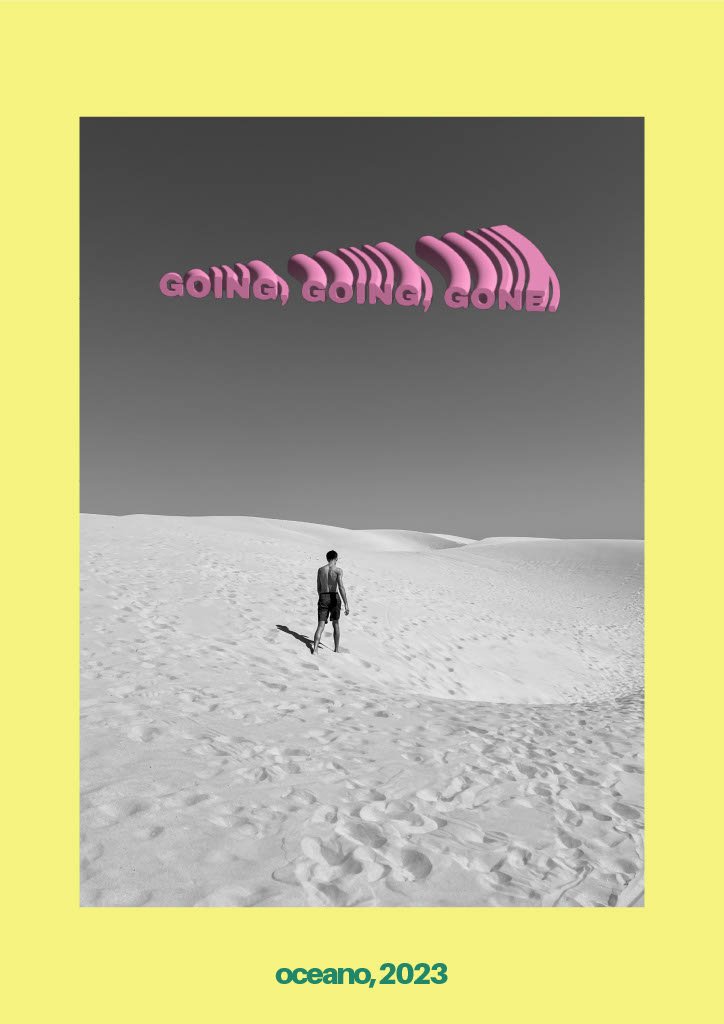
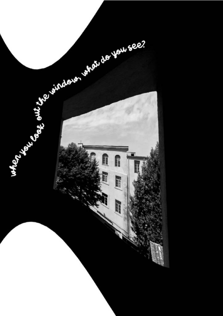
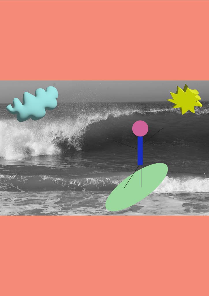
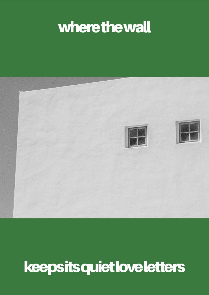
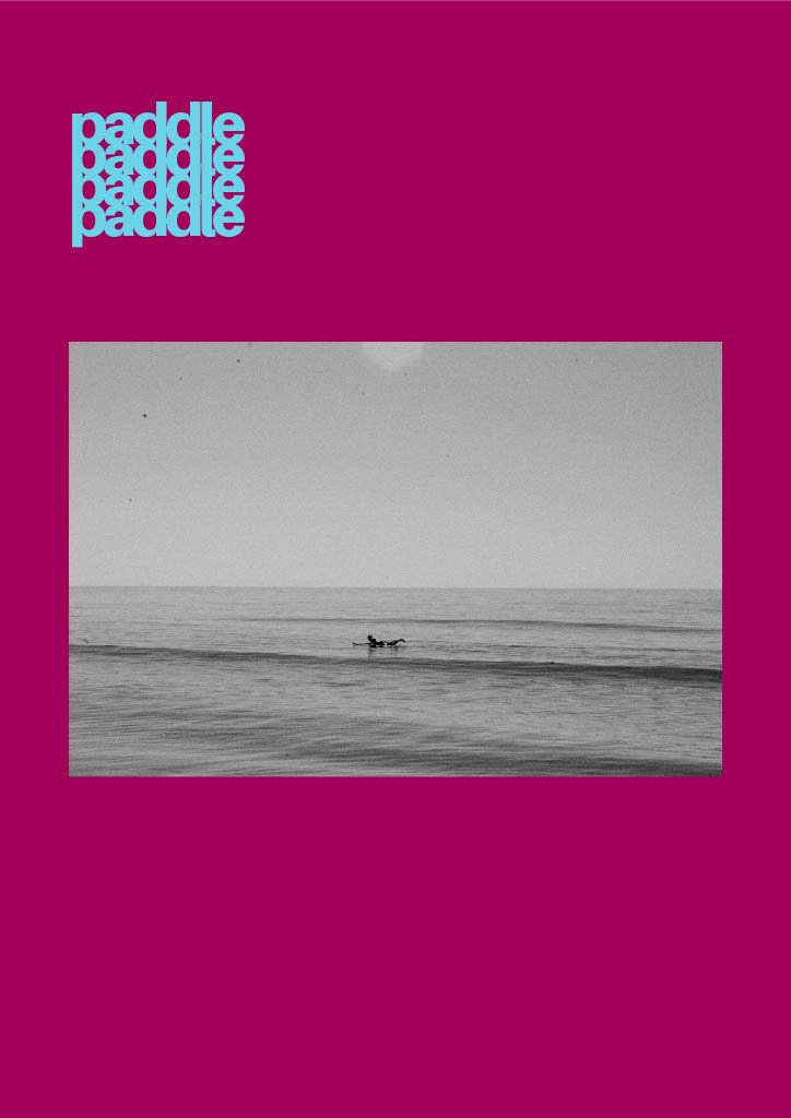
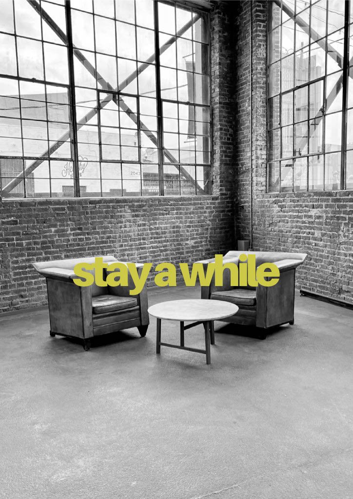
“collections" is my visual diary — a curated lens into the quiet corners of coffee shops, the solitude of solo travels, and the beauty of everyday scenes captured through my eyes. it’s a space designed to inspire, stir emotion, and spark connection among kindred creative souls — those who see the world not just as it is, but as it could be. a love letter to the art of noticing, 'collections' invites you to slow down, feel deeply, and create endlessly.

FIGMA DESIGNS


ILLUSTRATOR AND PHOTOSHOP


VIDEOGRAPHY